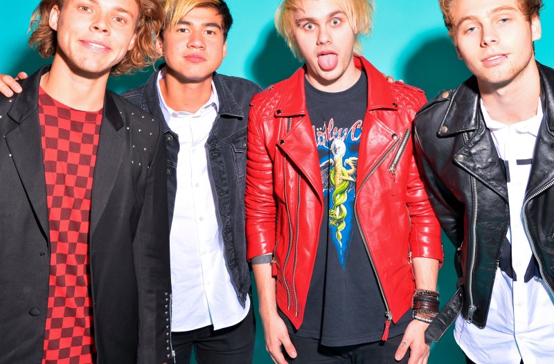
5 Seconds of Summer has officially changed their logo to avoid a major copyright battle! For years, the band has been rocking a tally logo, but a shop called Undefeated recently decided to sue the group for "copying" their trademark design.
Instead of getting into a lengthy legal fight with the store, 5SOS designed a new logo, which includes two skulls with hearts over the eye sockets instead of their infamous emblem.
Rt for the old 5sos logo
Fav for a new one #WeWantTheTallyBack pic.twitter.com/E7ApMiJw20— 🥀 (@takeitmutual) May 10, 2015
Even though their new look is still pretty cute, the 5SOSFam has been pretty upset about the change. When a fan asked for their old logo back, Calum Hood pretty much squashed all hopes for a return to their classic design.
It's kind of heartbreaking that their logo has changed, especially because it has a special meaning to fans. Each of the individual tallies represents all of the guys in the group, and then there's another one for their fans. (Hence, the five marks when there are only four band members.)
Y'all say its just a logo? Well its not,
it have meanings behind it ok #WeWantTheTallyBack pic.twitter.com/WLySj1dWct— syaf loves ashton ❥ (@iadoreirwin_) May 10, 2015
Still, we have to hand it to their design team — they've managed to turn a crazy situation into something positive. Their new band merch is pretty adorable!
brand new 2015 tour merch is now available on our store !! check it out here if you want to… http://t.co/F89v41XLnQ pic.twitter.com/8rCqc7rAH7
— 5 Seconds Of Summer (@5SOS) May 7, 2015
Which logo do you like better? Do you miss their old design? Sound off in the comments!
Love J-14? Be sure to subscribe to our YouTube channel for fun, exclusive videos with your favorite stars.


